Main figures
From our time series explorerIn focus
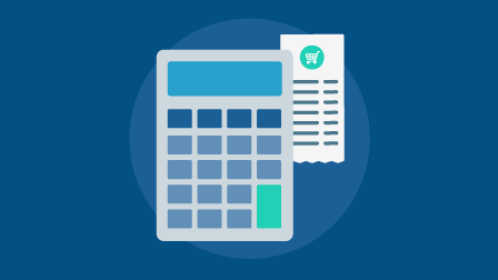
Personal inflation calculator
Tell us what you spend your money on to see how this affects your inflation rate.
Statistics from across the UK
How to use statistics produced by government and devolved administrations.

Population Statistics Consultation
See the latest publications and updates about the consultation.
Statistically Speaking
Catch up with every episode of our public data podcast series.
Personal inflation calculator
Tell us what you spend your money on to see how this affects your inflation rate.
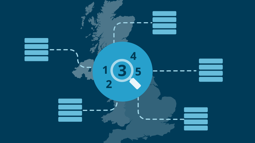
Statistics from across the UK
How to use statistics produced by government and devolved administrations.
Population Statistics Consultation
See the latest publications and updates about the consultation.
Statistically Speaking
Catch up with every episode of our public data podcast series.
Around the ONS
National Statistical
News and insight from the Office for National Statistics.
Secure Research Service
Find out how ONS secure data could help your research project.
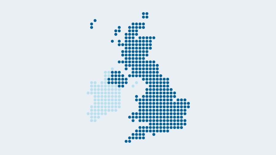
Explore local statistics
Find, compare and visualise statistics about places within the United Kingdom.

Other government statistics
Official Statistics available from across government.
National Statistical
News and insight from the Office for National Statistics.
Secure Research Service
Find out how ONS secure data could help your research project.
Explore local statistics
Find, compare and visualise statistics about places within the United Kingdom.
Other government statistics
Official Statistics available from across government.